Bridging the boroughs: An equity analysis of bike sharing in New York City
We’re excited to announce the the release of Bridging the boroughs: How well does New York’s bike sharing system serve New Yorkers?. This report was commissioned by New York Communities for Change, the leading organization advancing the cause of social and economic justice in New York City. Written by David Wachsmuth, Robin Basalaev-Binder, Natalie Pace and Lou Seltz, the paper examines the Citi Bike network from an economic and racial equity perspective, using spatial analysis to investigate the extent to which bike sharing helps to improve mobility options for New Yorkers most in need of such options. Specifically, we ask the following questions:
- Who has access to Citi Bike, and who doesn’t?
- How have the populations with access to Citi Bike changed since 2013?
- Which neighborhoods use Citi Bike, and which don’t?
- How should bike sharing expand in the future to address existing inequities and gaps in the transit system?
Our analysis finds that the Citi Bike network mainly serves a privileged population that already has strong transit options. Future expansions of bike sharing in NYC, either through the existing Citi Bike system or through the introduction of new competitors, should expand the effective size of the population who can access the subway in neighborhoods of high social need.
The full paper is publicly available for download. The research is based on 100% open and publicly available data, and all of our analysis is likewise available for public scrutiny, replication and reuse at GitHub. Using the code available there, anyone can produce the exact tables, charts, maps and empirical results as the ones in the report itself, and furthermore scrutinize all of our assumptions and methods. Below I summarize the main results and graphics from the paper.
1. Who has access to Citi Bike, and who doesn’t?
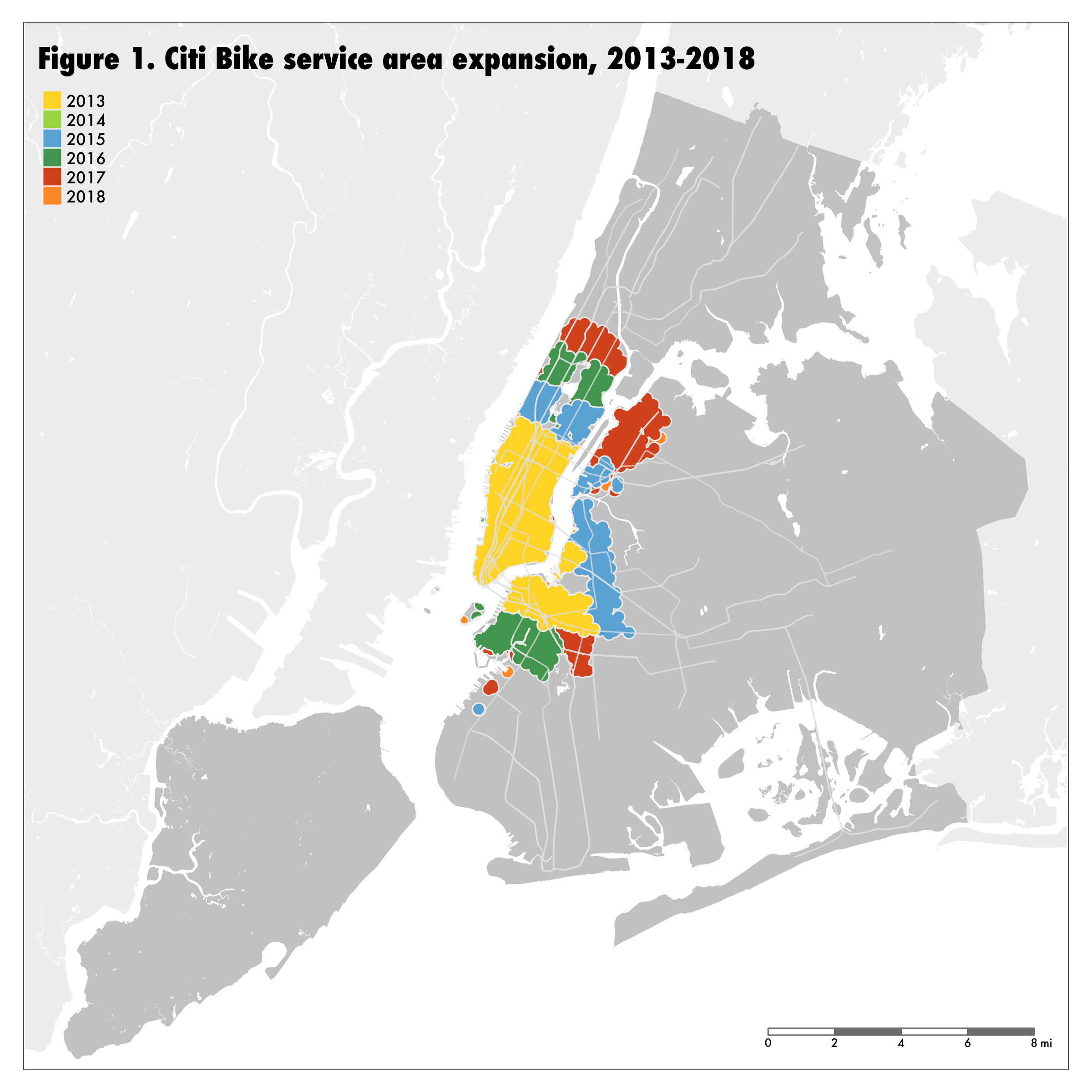
Citi Bike is New York City’s docked bike share system, initially announced by the New York City Department of Transportation in 2011. In 2012, Citibank was announced as the title sponsor, with Mastercard as the preferred payment partner. It launched in 2013 with a fleet of 6,000 bikes at 332 stations, located primarily in Manhattan and western Brooklyn, and was at the time the largest bike sharing network in the United States. The initial fleet serviced 827,000 people. Since then, it has seen multiple expansions (Figure 1), increasing both the number of stations and bikes as well as the area of the network. By the end of 2018 the system had 746 stations serving 1,988,000 people in a total service area of 30.7 square miles.
 From a demographic perspective, what do neighborhoods with good bike share access look like compared to ones without good access to Citi Bike? The answers we found weren’t encouraging. In general, Citi Bike serves the wealthiest, most privileged part of New York City. More than three quarters (76.8%) of New Yorkers do not have access to bike sharing, and the remaining 23.2% who do are wealthier, whiter and better educated than the rest of the city.
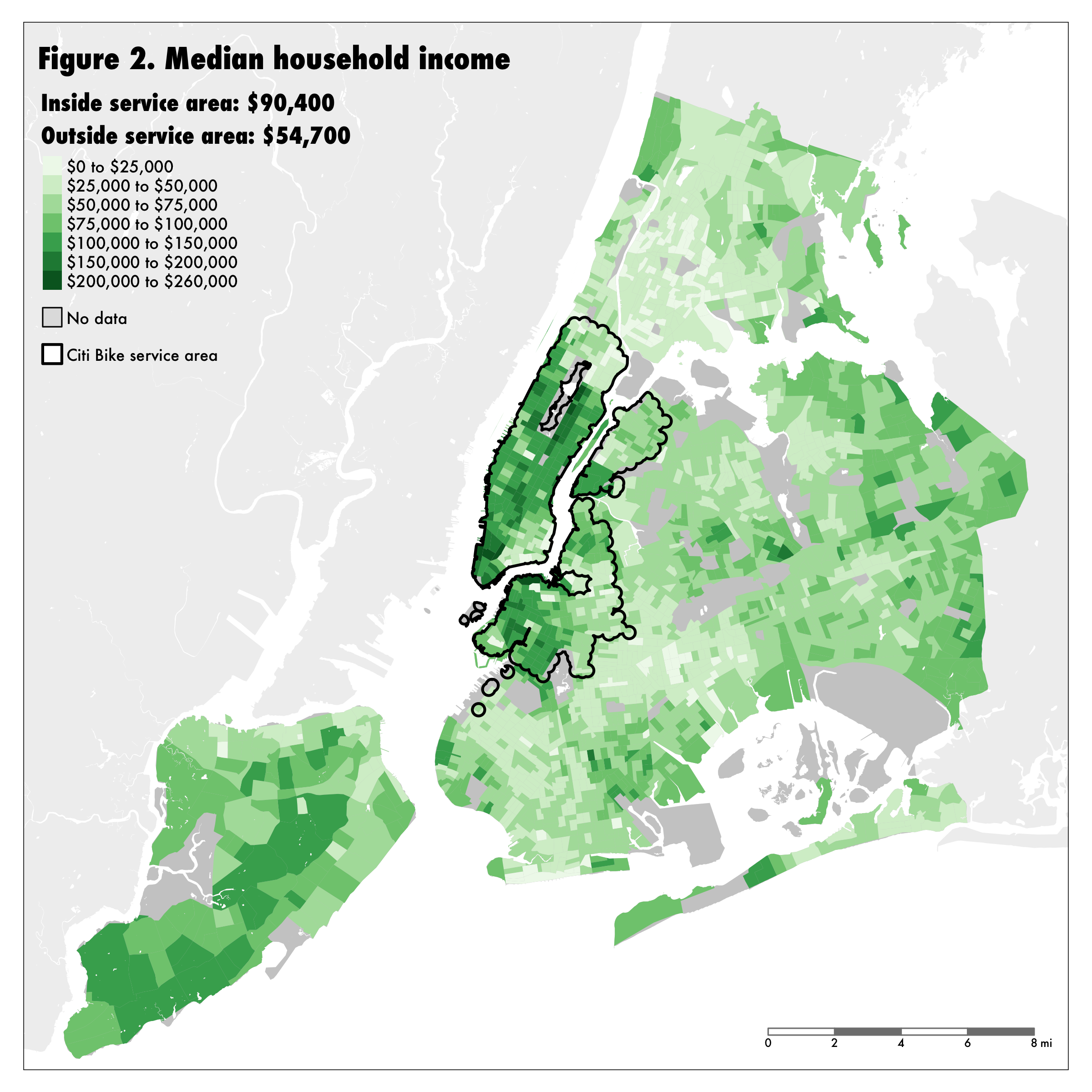
Focusing on income, people with access to Citi Bike are wealthier than those without access, with a median household income of $90,400 in service areas versus $54,700 outside service areas (Figure 2). The poorest parts of New York mostly lack bike sharing access, while the wealthiest parts of New York City are all located within Citi Bike’s service area. More than 7 in 10 of the neighborhoods with median household income under $20,000 lack bike sharing, while every neighborhood with a median household income higher than $200,000 has access.
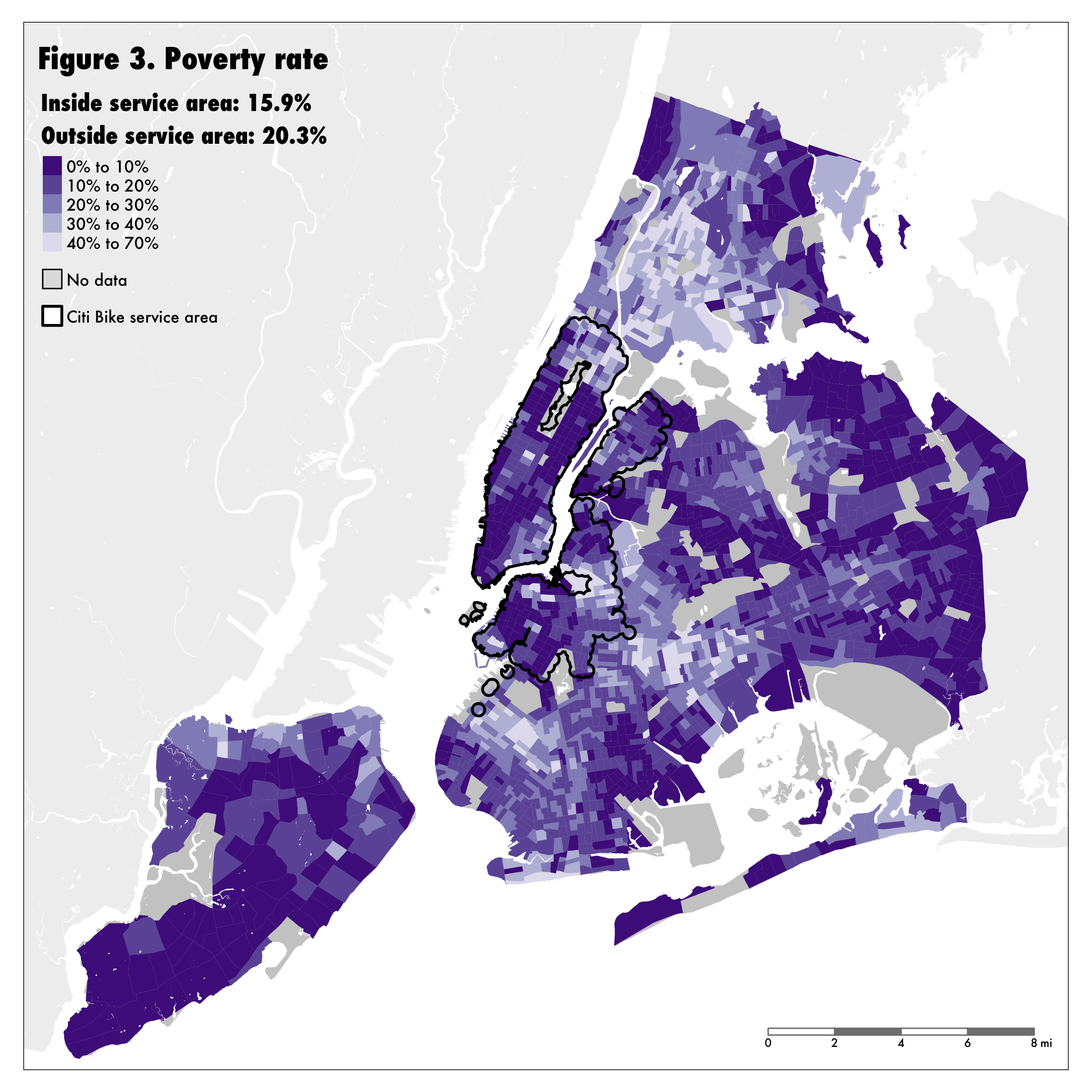
 Likewise, Citi Bike serves disproportionately few New Yorkers in poverty. While 20.3% of New Yorkers without bike sharing access live in poverty, this figure drops to 15.9% for New Yorkers with access. Meanwhile, three-quarters of neighborhoods in extreme poverty (where at least 45% of the population falls under the poverty threshold) are located outside the Citi Bike service area.
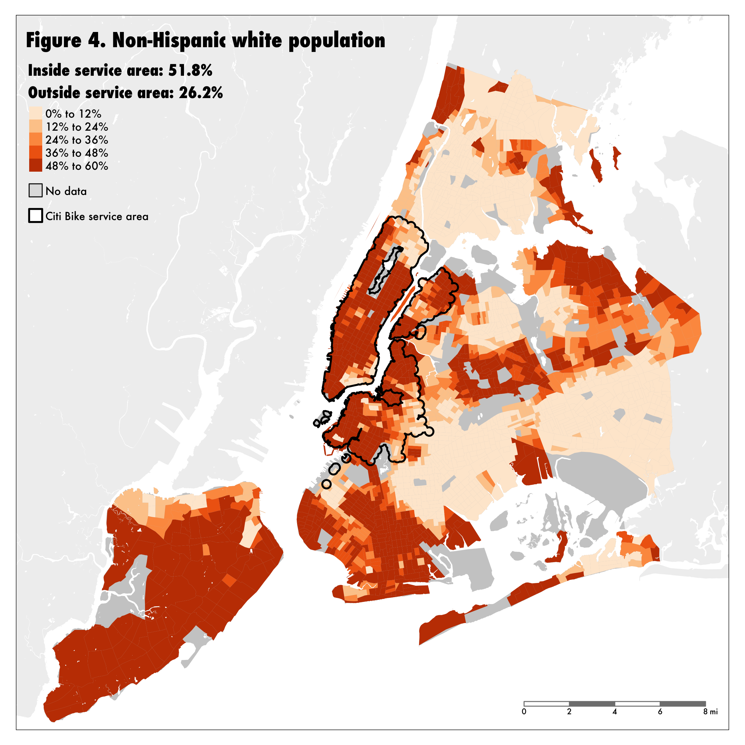
 Similar disparities exist when looking at race. Citi Bike serves disproportionately few New Yorkers of color; its service area is twice as white as the rest of the city. Just under a third (32.1%) of New Yorkers are non- Hispanic white, but more than half of people within Citi Bike’s service area are. Only 16.5% of people of color in New York City have access to bike sharing services, while 37.5% of white New Yorkers do (Figure 4).
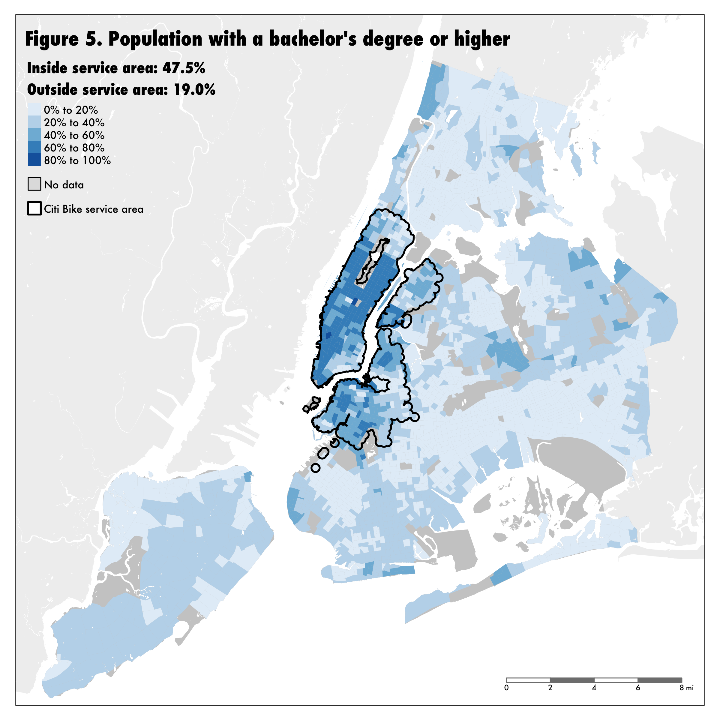
 People with access to Citi Bike are more educated than those without. 47.5% of the population with access to Citi Bike hold a bachelor’s degree or higher (Figure 5). Only 19.0% of the population without bike sharing access have a bachelor’s degree.
 Finally, Citi Bike overwhelmingly serves people who already have subway access. 2.5 million New Yorkers live further than half a mile from the subway, and only 94,000 of them (3.8%) have Citi Bike stations. But 95.3% of those with Citi Bike access also live close to the subway (Figure 6). 22.1% of the city’s population has access to both Citi Bike and the subway; 27.8% has access to neither. Those who have access to both are wealthier (median household income of $92,100 vs. $66,500), and whiter (52.7% vs. 31.2%), and have higher rates of educational attainment (48.4% have a bachelor’s degree or higher vs. 20.6%).
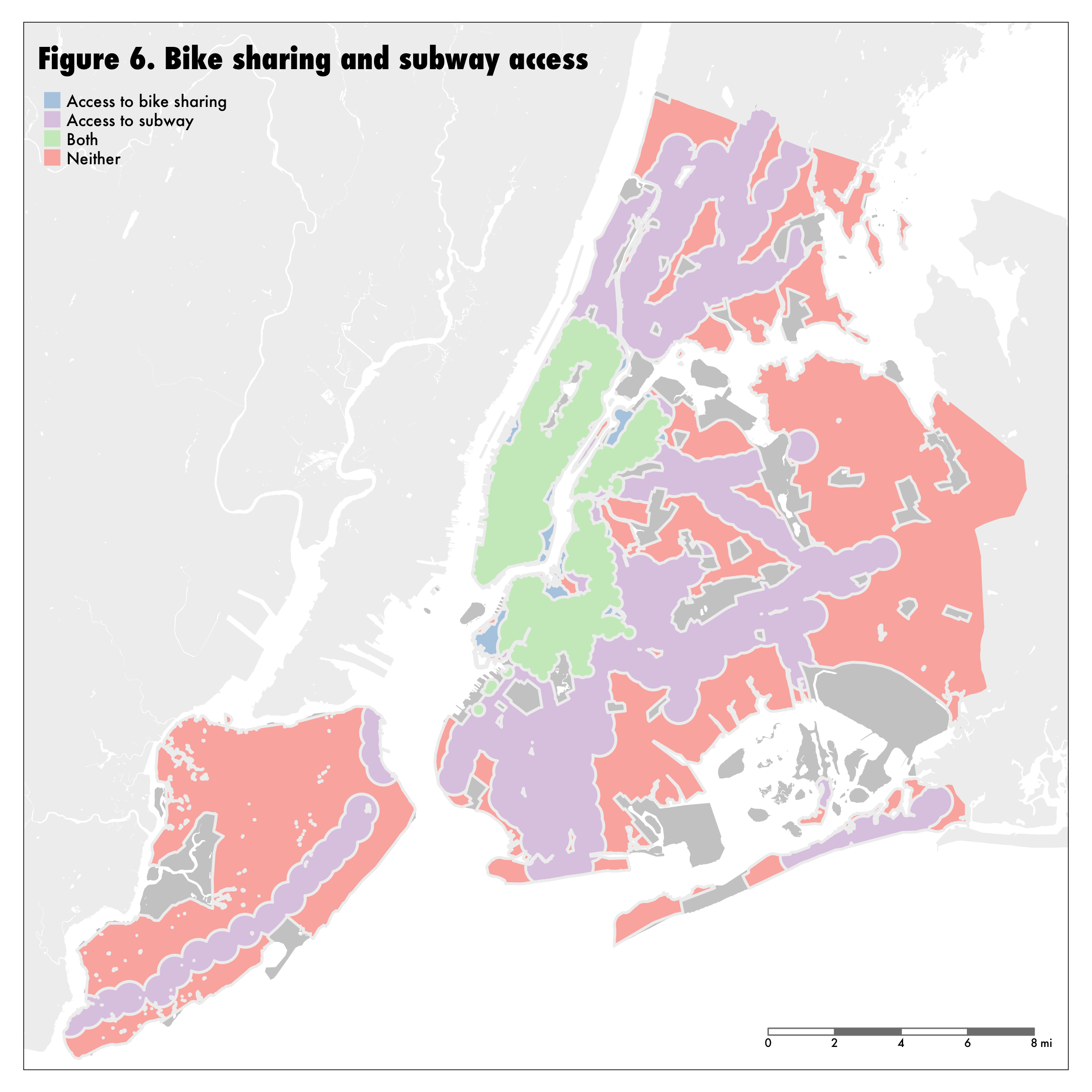
Figure 6
2. How have the populations with access to Citi Bike changed since 2013?
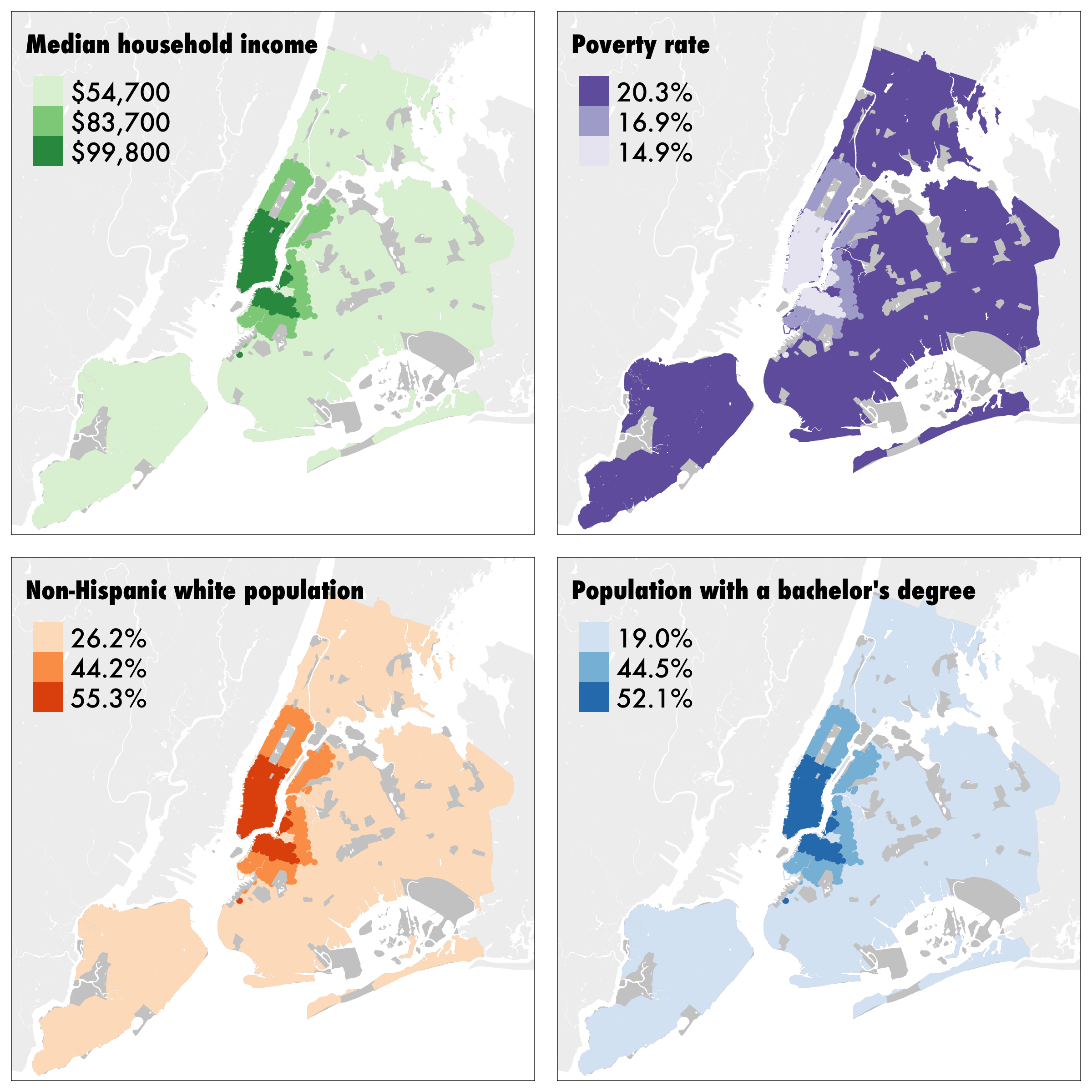
Since the Citi Bike network launched in 2013 serving 800,000 residents, 1.2 million more New Yorkers have gained access to the network. This additional population is only slightly more diverse and less affluent than the population which originally gained bike sharing access in 2013 (Figure 7). These 1.2 million residents have a median household income of $83,700 (compared to $54,700 in the portion of the city that remains without bike sharing access), a poverty rate of 16.9% (compared with 20.2% in the area of the city without bike service), 49.3% are white (compared with 26.2% in the rest of the city), and 44.2% have at least a bachelor’s degree (compared to 19.0% for the rest of the city).
3. Which neighborhoods use Citi Bike, and which don’t?
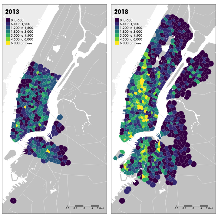
The analysis described so far has analyzed bike sharing in New York as a binary variable: areas with access versus areas without access. However, the fact that a bike sharing station exists does not guarantee that it will be used, and moreover there is a plausible difference between an area with stations spaced out every half mile and an area with stations every several blocks, although both areas would be classified as having bike sharing service. Accordingly, we also examined high-resolution data for four million individual trips taken on Citi Bikes in 2013 and 2018, in order to further explore the demographic and equity dimensions of bike sharing access in New York.
In the months of June and December of 2013, Citi Bike users took 1.02 million rides—an average of 16,750 per day. Five years later in 2018, the equivalent numbers were 2.97 million rides in June and December, for an average of 48,700 rides per day. The bike sharing network expanded substantially over these five years, but the average number of daily rides per station increased by 24.1% (Figure 8).
 What are the demographic differences in bike sharing ridership across New York? It is impossible to answer this precisely, because Citi Bike does not collect detailed information about its riders. However, a reasonable approximation can be made by correlating the demographics of the service area for each Citi Bike station with the number of rides taken from that station. Figure 9 presents the results of this analysis, showing the correlation between daily ride density per square mile and the four demographic variables analyzed above, in addition to total population in the service area and distance of the bike station to Broadway. Two main findings emerge from this analysis. The first is that there are positive correlations between ride density and median household income, whiteness and education, and negative correlations between ride density and total population, the poverty rate, and distance to Broadway. This means that bike sharing stations with higher daily ride densities tend to be located in areas which are richer, whiter, better educated, less populated, and closer to Broadway than stations with lower daily ride densities. However, the second finding is that all of these relationships are relatively weak. The strongest correlation between ride density and any of the variables under examination is -0.33 (this and all other values in Figure 9 are Pearson correlation coefficients) for distance to Broadway, while the correlation between ride density and the poverty rate is -0.11—barely distinguishable from a completely random relationship.
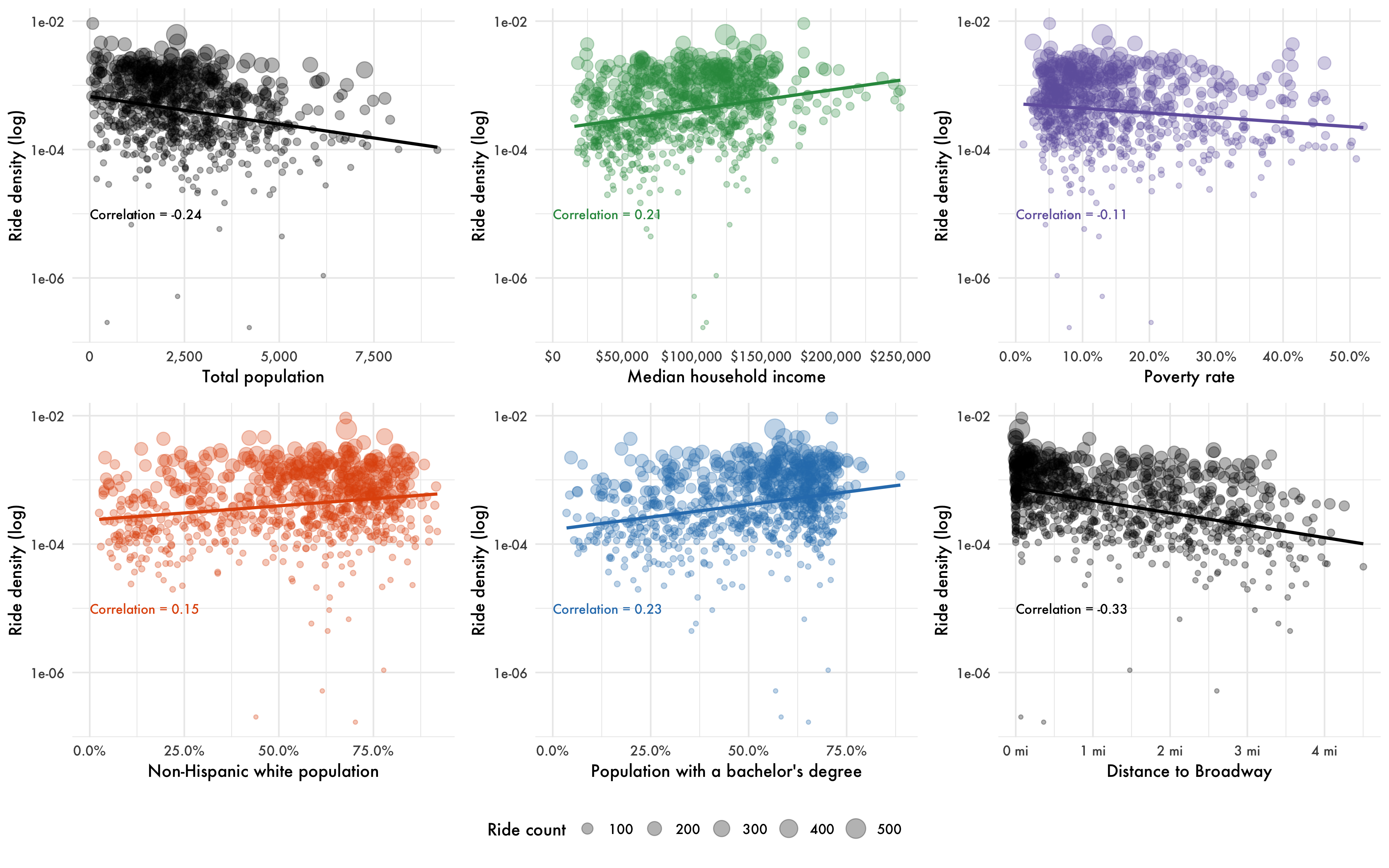 We also ran a linear regression model to predict rides per square mile, and the results of this model were similarly weak. The conclusion is that ridership is not strongly influenced by spatial patterns of social advantage and disadvantage, a finding which suggests the validity of the binary bike sharing service area comparisons (areas with service versus areas without service) elsewhere in the report.
4. How should bike sharing expand in the future to address existing inequities and gaps in the transit system?
The last question we examined was how New York’s bike sharing network should expand in the future. If equity were to be re-introduced as a key system priority, what would a just expansion of the bike sharing network look like? Our framework suggests two possibilities for expanding bike sharing service: neighborhoods with high social vulnerability, and areas with limited existing access to transit. While it may not be possible to expand bike sharing to all of the target areas that would benefit from it, this analysis identifies priority areas according to each expansion priority.
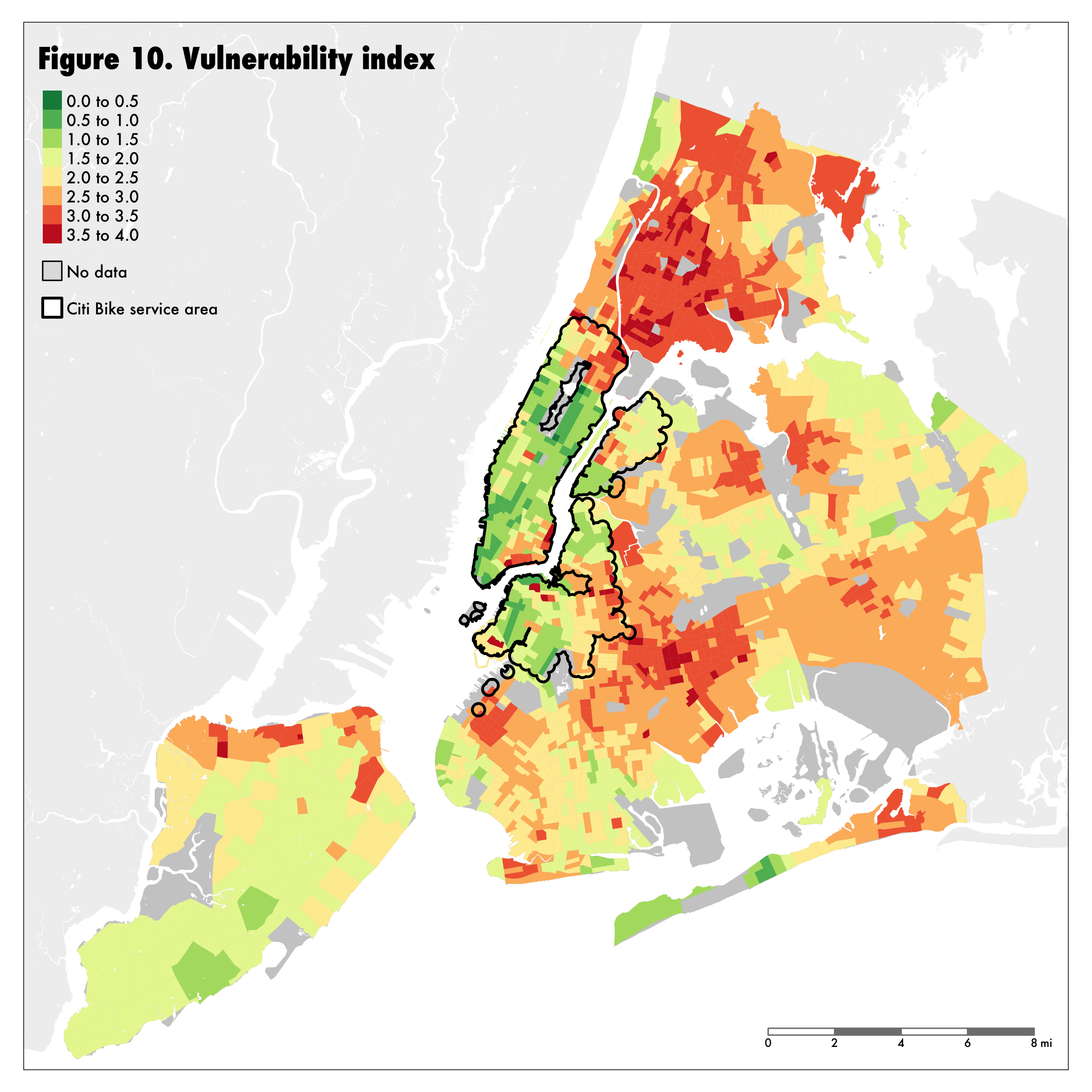
To identify these priority areas, we began by constructing a vulnerability index, combining the four demographic variables discussed previously in the report (median household income, percentage of the population living in poverty, the percentage of the population which are people of color, and the percentage of the population without a bachelor’s degree) into a single synthetic measure. Figure 10 shows vulnerability by census tract across New York City.
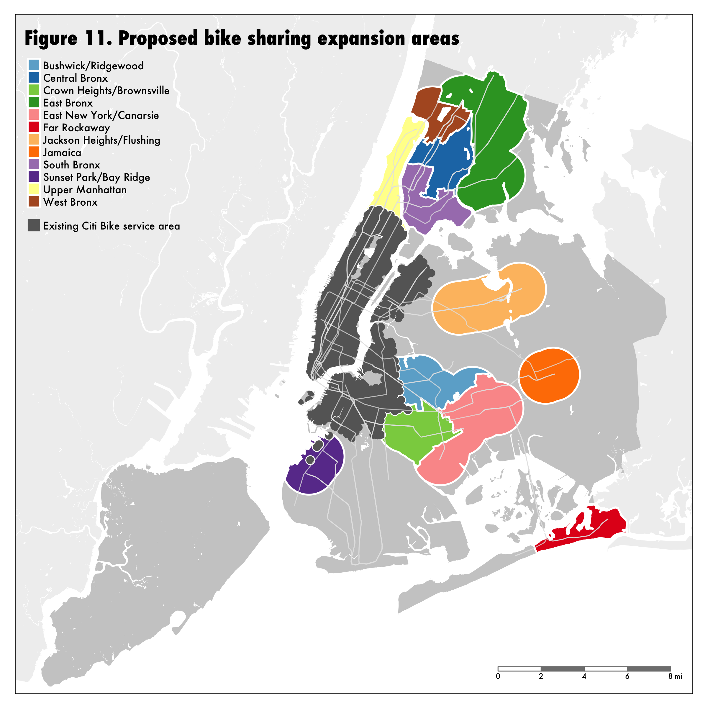
 Next we identify extended subway service areas of 1.24-mile-radius circles around subway station, which is a distance too far to conveniently walk to the subway but feasible to bike. For each of these areas, we measure the average vulnerability score, and areas whose score exceeds 2.75 on our 4-point scale (corresponding to the 67th percentile for individual census tracts) are selected as potential bike sharing expansion areas. We further divide these areas by existing neighborhood boundaries (using the public-use microdata areas from the census, which roughly correspond to New York’s community boards), and arrive at 12 priority neighborhoods for bike sharing expansion, distributed throughout Brooklyn, the Bronx, Manhattan and Queens. These are indicated in Figure 11.
 Social vulnerability and existing access to transit present two different and potentially competing priorities in expanding the bike share network. Figure 12 displays the potential expansion neighborhoods from the perspective of social vulnerability, and demonstrates clearly that the Bronx has the most objective need in this regard.
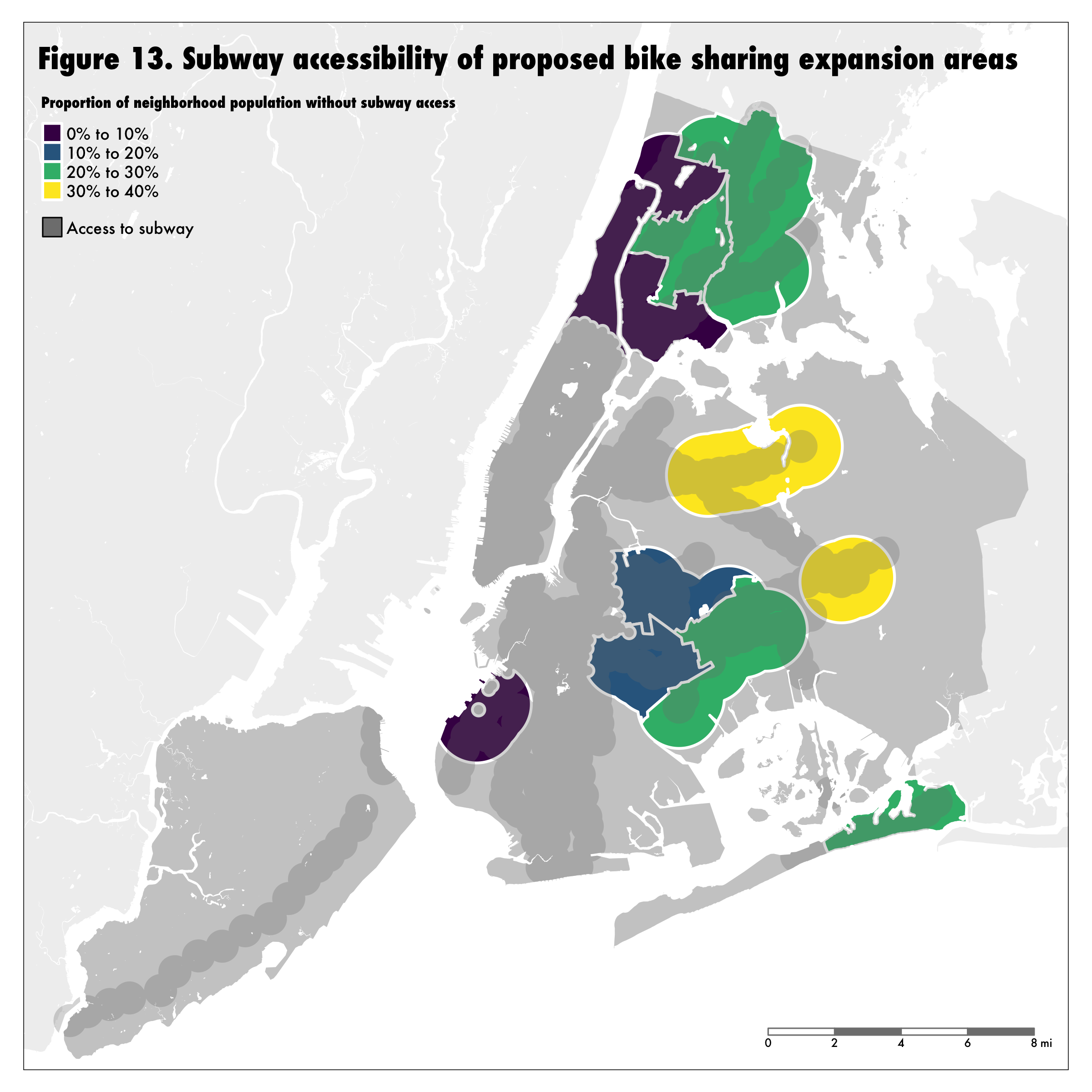
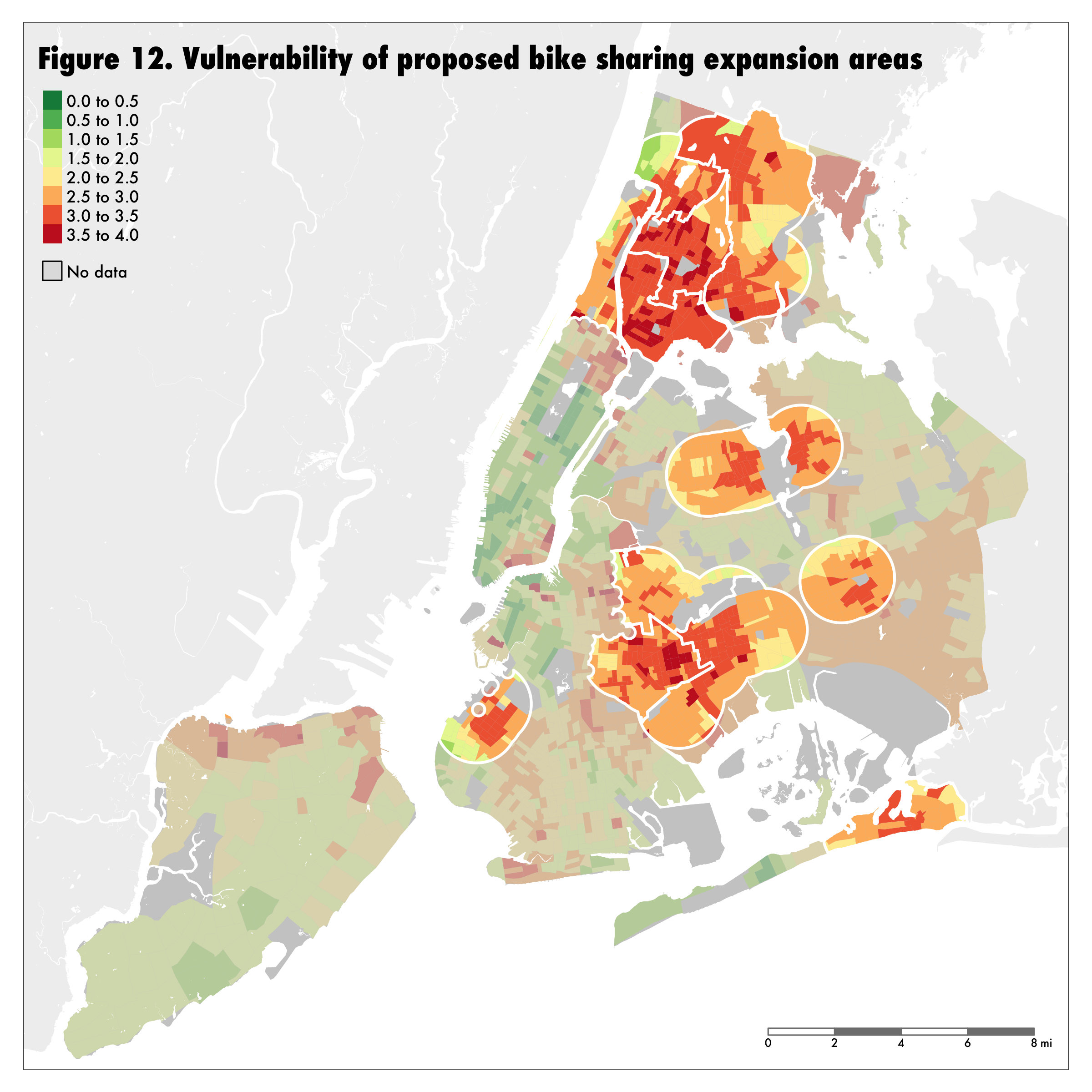 Figure 13 considers the identified expansion areas from the perspective of where the most effective number of new transit riders would be added. It presents a rather different picture from the social vulnerability analysis; in particular, neighborhoods in Queens which were at the low end of the vulnerability scale (relative to the remainder of the proposed expansion areas) have larger subway accessibility deficits than many of the neighborhoods with more social vulnerability.
 In total, across these twelve possible expansion neighborhoods there are 3.7 million New Yorkers who would be viable potential recipients of bike sharing service if equity were a priority for the system. In particular, these neighborhoods contain 760,000 disproportionately poor and non-white New Yorkers (85.9% non-white with a median household income of $50,800) who do not have easy access to the subway. While the existing Citi
Bike network has mostly served wealthy and white residents of central Manhattan and surrounding areas, it is these 760,000 New Yorkers for whom bike sharing could significantly improve their mobility and thus their social and economic prospects. Their interests should be prioritized in future bike sharing expansions in New York.
In total, across these twelve possible expansion neighborhoods there are 3.7 million New Yorkers who would be viable potential recipients of bike sharing service if equity were a priority for the system. In particular, these neighborhoods contain 760,000 disproportionately poor and non-white New Yorkers (85.9% non-white with a median household income of $50,800) who do not have easy access to the subway. While the existing Citi
Bike network has mostly served wealthy and white residents of central Manhattan and surrounding areas, it is these 760,000 New Yorkers for whom bike sharing could significantly improve their mobility and thus their social and economic prospects. Their interests should be prioritized in future bike sharing expansions in New York.
‘Bridging the boroughs: How well does New York’s bike sharing system serve New Yorkers?’ is publicly available for download.
David Wachsmuth
Canada Research Chair in Urban Governance
My research interests include urban governance, local sustainability, and the impact of short-term rentals on housing markets.