Making beautiful inset maps in R using sf, ggplot2 and cowplot

Our research project on short-term rentals involves a lot of solving similar problems multiple times with different large data sets. For example, we very frequently want to estimate how many housing units have been converted to full-time STRs in a given city, or chart the growth rate in active daily listings. In order to solve these problems in a durable fashion, so we don’t have to reinvent the wheel every time we start a new project, UPGo has gradually moved to an almost entirely script-based analytical flow. Some of this work happens in Python, but our workhorse language is R, which is a natural fit for the kind of data-science and statistics-based work we do.
One of the challenges we encountered early on was how to make beautiful maps suitable for our public reports. With these reports we want to emphasize visual clarity and consistency, sometimes at the expense of the details which would be appropriate for scientific publication. The tmap package is an excellent choice for powerful sf-based mapping in R, but, given that our non-map charts are all produced with ggplot2, I was eager to see whether we could develop a single set of common theming (e.g. colours and fonts) and apply it to all our visuals. It turns out that we could, and in our recent work all of our maps have been produced using ggplot2!
In this post I am going to recreate one of the maps from one of our recent reports, “Short-term rentals in Halifax: UPGo city spotlight”. It is a choropleth map of the distribution of STR listings across the Province of Nova Scotia, expressed as a percentage of total dwellings, and it features an inset map focused on downtown Halifax.
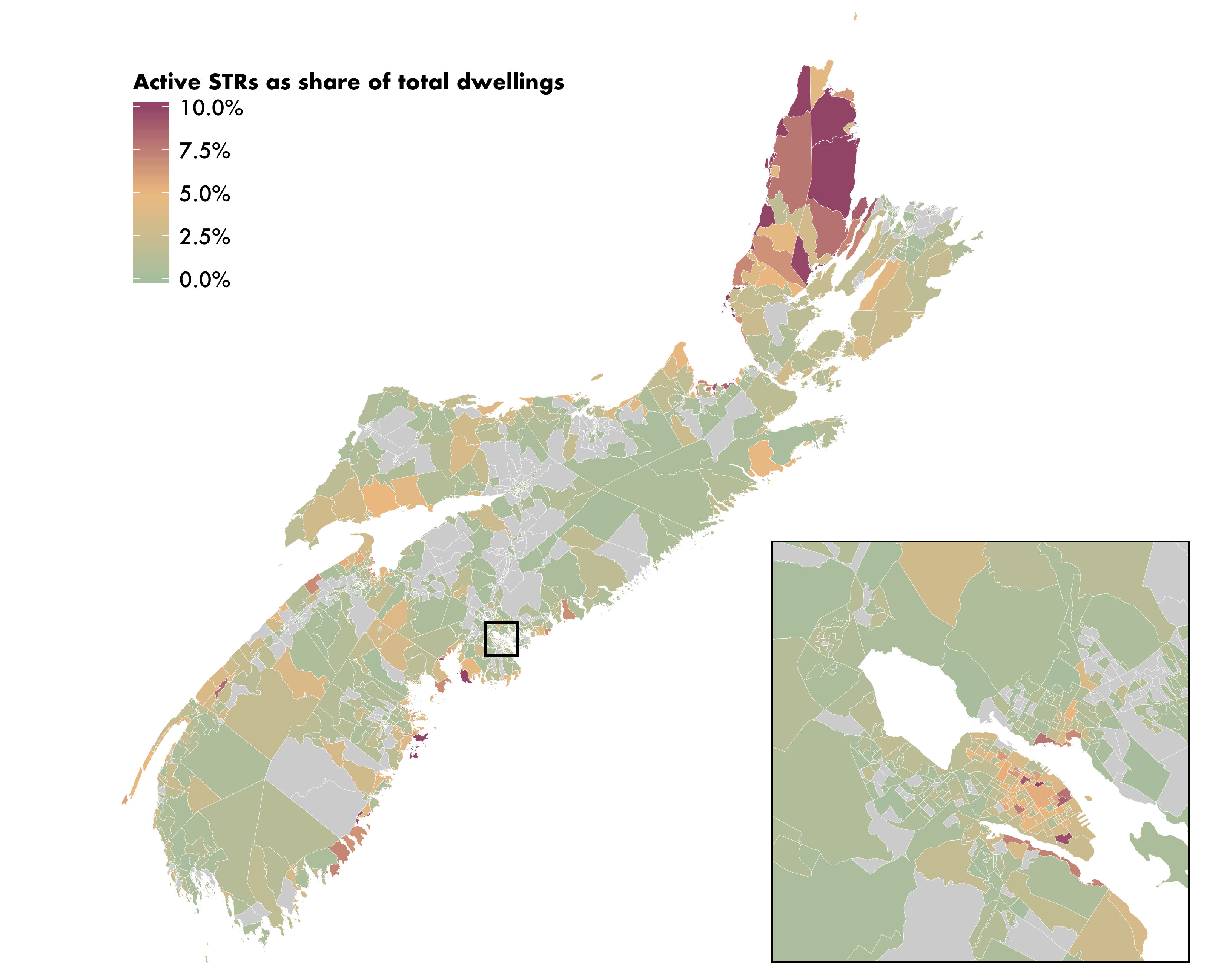
Active STRs as a share of all dwelling units in Nova Scotia, by dissemination area
Getting started
I’m going to begin by describing some of the setup and data wrangling; folks who just want to know how to make the maps may want to skip ahead to Making the map.
The workhorses of our process will be the dplyr, ggplot2 and sf packages, so we’ll start by attaching them.
library(dplyr)##
## Attaching package: 'dplyr'## The following objects are masked from 'package:stats':
##
## filter, lag## The following objects are masked from 'package:base':
##
## intersect, setdiff, setequal, unionlibrary(ggplot2)
library(sf)## Linking to GEOS 3.7.2, GDAL 2.4.2, PROJ 5.2.0Next, we need some data. The default scale of analysis for choropleth mapping in urban geography and planning is the census tract, which strikes a good balance between detailed geography and low-error estimates. However, since we’re making a map covering the entire Province of Nova Scotia, which isn’t all enumerated into census tracts, we have to use dissemination areas, which are the smallest census geography in Canada for which all data is publicly released. Because our map of STR listings will be normalized by dwelling units, we will need to get dwelling counts per dissemination area. We can import both the census geometries and the dwelling counts in one easy step using the excellent cancensus package. (If you’re working with US census or ACS data, tidycensus is similarly excellent.) Note that if you’ve never used the cancensus package before, you’ll need to get an API key at censusmapper.ca and enter it into your .Renviron file.
library(cancensus)
DAs <-
cancensus::get_census(
# The dataset you want to download (usually "CA16" for the 2016 census)
dataset = "CA16",
# The geographies for which you want your data (a full list can be found using list_census_regions())
regions = list(PR = "12"),
# The scale you want your data enumerated at
level = "DA",
# If you want spatial attributes, add the geo_format argument
geo_format = "sf"
) %>%
# We'll reproject the data into UTM 17N, the Nova Scotia UTM zone
sf::st_transform(32617)The result is an sf tibble with one row per dissemination area, and a few basic variables, including dwellings. (If you want additional census variables, you add the vectors argument to your get_census call.)
DAs## Simple feature collection with 1658 features and 10 fields
## geometry type: MULTIPOLYGON
## dimension: XY
## bbox: xmin: 1666387 ymin: 4914789 xmax: 2207339 ymax: 5445659
## epsg (SRID): 32617
## proj4string: +proj=utm +zone=17 +datum=WGS84 +units=m +no_defs
## # A tibble: 1,658 x 11
## `Shape Area` Type Dwellings Households GeoUID Population CD_UID CSD_UID
## * <dbl> <fct> <int> <int> <chr> <int> <chr> <chr>
## 1 1123. DA 319 215 12010… 448 1201 1201006
## 2 5.03 DA 213 204 12010… 417 1201 1201008
## 3 0.757 DA 240 223 12010… 455 1201 1201008
## 4 1.02 DA 245 200 12010… 408 1201 1201008
## 5 2.26 DA 211 196 12010… 463 1201 1201008
## 6 38.1 DA 278 240 12010… 516 1201 1201006
## 7 56.4 DA 210 189 12010… 448 1201 1201006
## 8 66.7 DA 443 326 12010… 705 1201 1201006
## 9 130. DA 292 205 12010… 466 1201 1201006
## 10 409. DA 458 286 12010… 640 1201 1201001
## # … with 1,648 more rows, and 3 more variables: CMA_UID <chr>, CT_UID <chr>,
## # geometry <MULTIPOLYGON [m]>Because the dissemination area table we imported from cancensus already has spatial attributes, we can make a simple map using the geom_sf function from ggplot2:
DAs %>%
ggplot() +
geom_sf()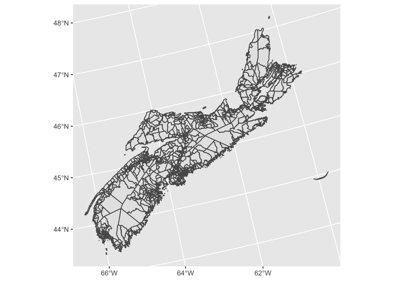
Adding our short-term rental data
The next step is joining our short-term rental data to our DAs table. The underlying data we use is proprietary, so I can’t reproduce it in its raw form here. But I will describe how it is structured and what steps I followed to wrangle it, and then link to a publicly available summary which can generate the map.
The “raw” file is property_NS, a table with every Airbnb and HomeAway/VRBO listing in Nova Scotia, along with the structural properties of the listing (e.g. is it an entire home or private room, its latitude and longitude, and how many bedrooms it has). I run this table through several of the functions in strr, the open-source package we have developed for analyzing STR data, which is currently available through GitHub as a development preview, and is scheduled to arrive on CRAN in the next several months.
# Use devtools::install_github("UPGo-McGill/strr") to install a development version of the package
library(strr)
listings_NS <-
property_NS %>%
# Filter to only listings in actual housing units which were active on Aug 31 2019
dplyr::filter(
housing == TRUE,
created <= "2019-08-31",
scraped >= "2019-08-31"
) %>%
# Convert to sf object in the correct projection
strr::strr_as_sf(32617) %>%
# Assign each listing to a dissemination area using our custom statistical procedure
strr::strr_raffle(DAs, GeoUID, Dwellings, cores = 4) %>%
# Drop the spatial attributes
sf::st_drop_geometry() %>%
# Tally the number of active listings per dissemination area
dplyr::count(GeoUID)The result is a table with one row per dissemination area, and two columns: one identifying each DA with a GeoUID and one describing the total number of active STR listings. This table is hosted on the UPGo website for anyone who wants to follow along with the example themselves.
load(url("https://upgo.lab.mcgill.ca/data/listings_NS.Rdata"))
listings_NS## # A tibble: 1,057 x 2
## GeoUID n
## <chr> <int>
## 1 12010030 4
## 2 12010031 10
## 3 12010032 2
## 4 12010033 7
## 5 12010035 4
## 6 12010036 1
## 7 12010037 14
## 8 12010039 8
## 9 12010040 3
## 10 12010042 1
## # … with 1,047 more rowsThe last step is to join the listings into our dissemination areas table. While we’re at it, we’ll drop some unnecessary fields and clean up the field names. Also, our DA polygons are very detailed, but since we’re not planning to leverage any of that detail for spatial operations, we can simplify the polygons by removing some of the vertices, which will dramatically speed up the mapping while having more or less zero impact on the final output.
DAs <-
DAs %>%
dplyr::left_join(listings_NS) %>%
dplyr::select(GeoUID, dwellings = Dwellings, listings = n, geometry) %>%
# Simplify polygons while preserving internal topology, so islands aren't accidentally erased
sf::st_simplify(preserveTopology = TRUE, dTolerance = 5)## Joining, by = "GeoUID"DAs## Simple feature collection with 1658 features and 3 fields
## geometry type: GEOMETRY
## dimension: XY
## bbox: xmin: 1666388 ymin: 4914789 xmax: 2207339 ymax: 5445659
## epsg (SRID): 32617
## proj4string: +proj=utm +zone=17 +datum=WGS84 +units=m +no_defs
## # A tibble: 1,658 x 4
## GeoUID dwellings listings geometry
## <chr> <int> <int> <GEOMETRY [m]>
## 1 120100… 319 4 POLYGON ((1746426 5017585, 1759270 5007455, 17726…
## 2 120100… 213 10 POLYGON ((1763788 4967526, 1763619 4967399, 17633…
## 3 120100… 240 2 POLYGON ((1762700 4967619, 1762781 4967472, 17629…
## 4 120100… 245 7 POLYGON ((1762446 4966633, 1762539 4966495, 17626…
## 5 120100… 211 NA POLYGON ((1764227 4967031, 1764932 4966221, 17647…
## 6 120100… 278 4 MULTIPOLYGON (((1768292 4971361, 1768326 4971322,…
## 7 120100… 210 1 POLYGON ((1769241 4966361, 1769291 4966267, 17694…
## 8 120100… 443 14 MULTIPOLYGON (((1761998 4966960, 1762079 4966856,…
## 9 120100… 292 NA POLYGON ((1763453 4953524, 1763180 4952764, 17631…
## 10 120100… 458 8 MULTIPOLYGON (((1744234 4978860, 1744316 4978825,…
## # … with 1,648 more rowsMaking the map
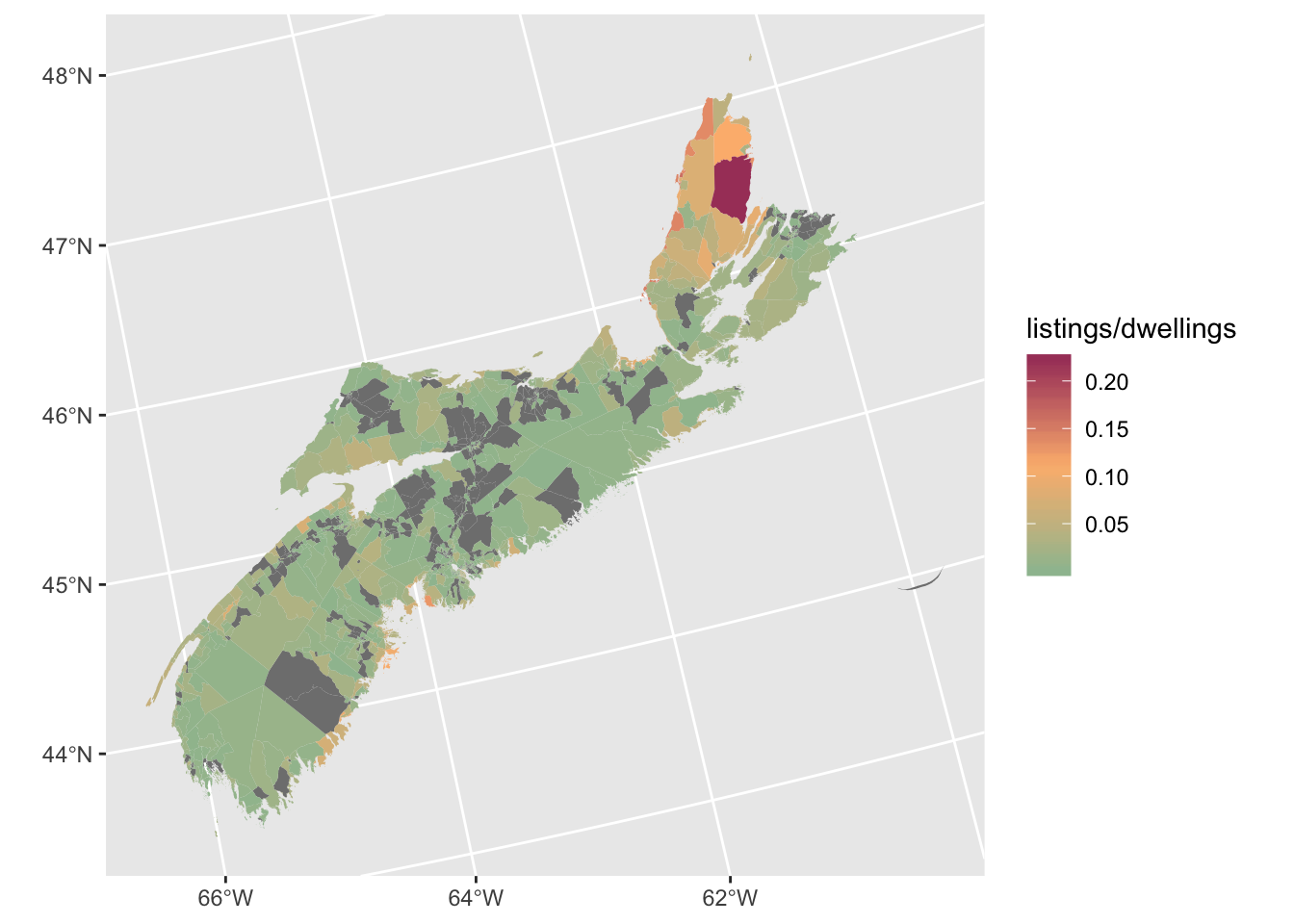
Now we’re ready to make the map! One of the cartography deadly sins is using a choropleth map to displayed raw counts of a variable (listings, in our case), because the size of your polygons will interfere with the meaning of the variable distribution. You always need to normalize your counts to convert them into meaningful ratios; the two standard options are normalizing by area (in our case, listings per square kilometre or something similar) or normalizing by population (in our case, listings per dwelling, since our “population” is actually housing units). We’re trying to display listings per DA, normalized by dwelling count, and we can get a quick result in just three lines of code.
DAs %>%
ggplot() +
geom_sf(aes(fill = listings / dwellings))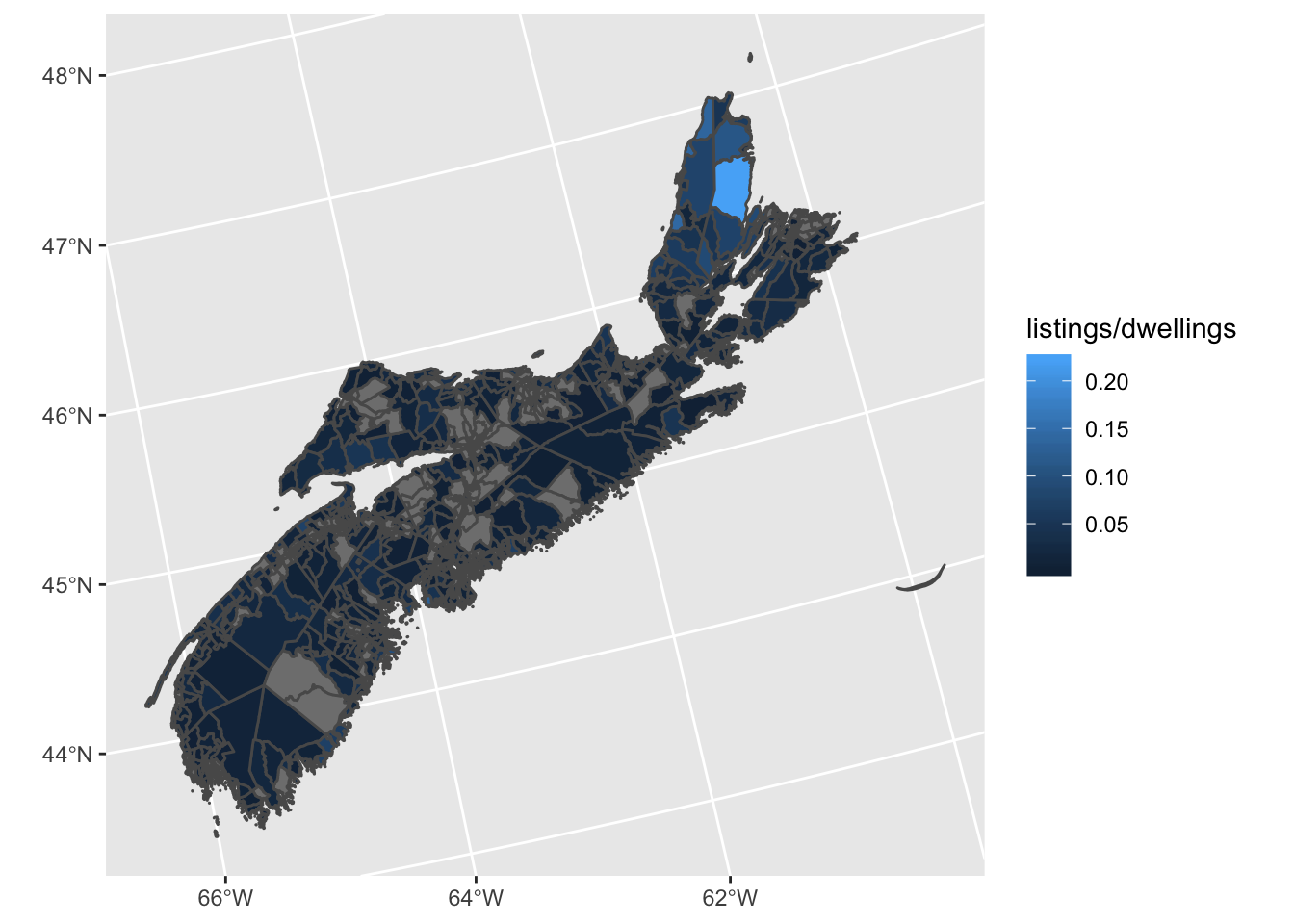
That works, but the small DA size coupled with the grey polygon outlines makes the map very hard to read, and the rest of the aesthetics could use a little punching up. So let’s try again, with some tweaks to the visuals. I’m going to set the line width to zero, but also change the line colour to white. This might seem superfluous, but in fact when R outputs vector graphics to PDF, lines get drawn even when the line width is set to zero, just with extremely small width. If you truly want the lines to vanish, you can set the colour to “transparent”, but I like the way very subtle white lines look in the maps, so I do it this way. I’m also going to define my own custom colour ramp for the symbology. One of the features of our UPGo reports is that each one gets a set of theme colours which are used consistently throughout the report. In the case of the Halifax report, the key colours were, in descending order of importance:
scales::show_col(c("#9DBF9E", "#A84268", "#FCB97D", "#C0BCB5", "#4A6C6F", "#FF5E5B"))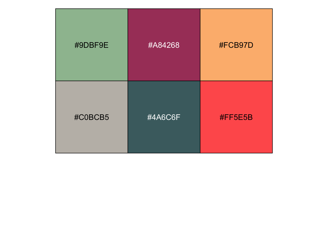 I noticed when I was getting ready to make the maps for the report that the top three colours would work well as a ramp, from green through orange to red. That sequence communicates directionality quite clearly: red means “more” and green means “less”, with orange in between. In general, cartographers frown on using sharply contrasting colours when symbolizing a sequential variable–the idea is that you should save contrasting colours for diverging variables, where you’re showing, e.g., areas of growth versus areas of decline. But this is a case where the aesthetic considerations of making visually striking maps that fit into the overall colour scheme of the report won out.
DAs %>%
ggplot() +
geom_sf(
aes(fill = listings / dwellings),
lwd = 0,
colour = "white"
) +
scale_fill_gradientn(
colors = c("#9DBF9E", "#FCB97D", "#A84268")
)
Now we’re getting somewhere. But there are still a few problems here. First, the DAs with no listings (hence NA values) are visually too dominating, so let’s lighten the grey. Second, the map is too green: the default scale is too stretched out, because of the presence of some extremely high values on Cape Breton Island, at the north of the map. So let’s squish the scale to max out at 10% rather than 20%. Finally, let’s give the legend a proper title, and format the labels as percentages rather than decimals.
DAs %>%
ggplot() +
geom_sf(
aes(fill = listings / dwellings),
lwd = 0,
colour = "white") +
scale_fill_gradientn(
colors = c("#9DBF9E", "#FCB97D", "#A84268"),
# Redefine the fill colour for NA values
na.value = "grey80",
# Set the scale limits to be 0 and 10%
limits = c(0, 0.1),
# Set the out-of-bounds ("oob") rule to squish out-of-bounds values to the nearest limit
oob = scales::squish,
# Format labels as percentages
labels = scales::percent,
# Give the scale a title
name = "Active STRs as share of total dwellings"
)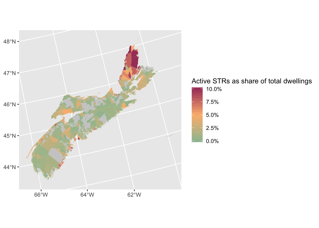
Much better. The last step to produce the basic map is to remove some of the visual cruft from the background, and re-position the legend over the main plot area, taking advantage of the fact that Nova Scotia is shaped diagonally and so our plot has a lot of empty space. After a bit of trial and error, I found that the best spot for it was in the upper left corner.
DAs %>%
ggplot() +
geom_sf(
aes(fill = listings / dwellings),
lwd = 0,
colour = "white") +
scale_fill_gradientn(
colors = c("#9DBF9E", "#FCB97D", "#A84268"),
na.value = "grey80",
limits = c(0, 0.1),
oob = scales::squish,
labels = scales::percent,
name = "Active STRs as share of total dwellings") +
# Set a completely blank theme, to get rid of all background and axis elements
theme_void() +
theme(
# legend.justification defines the edge of the legend that the legend.position coordinates refer to
legend.justification = c(0, 1),
# Set the legend flush with the left side of the plot, and just slightly below the top of the plot
legend.position = c(0, .95)
)
A final, optional tweak that I make is to change the font of the legend. Our house font at UPGo is Futura, and I have it installed on my computer, so I can use the extrafont package to load the font and make it available in R. (This can be a surprisingly hard procedure, depending on how picky you are about your fonts and the output destination. For example, the code which follows will work if your output device is bitmapped, such as the RStudio viewer or a PNG, but it will not work if you’re trying to output to PDF, in which case a series of tweaks are necessary. I’m planning on writing a post summarizing my hard-fought knowledge in this area in the near future.) I’m going to put the font arguments in a separate theme function at the end of the ggplot stack, so that it is easy to delete it if you don’t have Futura installed and still want to reproduce the map.
library(extrafont)
DAs %>%
ggplot() +
geom_sf(
aes(fill = listings / dwellings),
lwd = 0,
colour = "white"
) +
scale_fill_gradientn(
colors = c("#9DBF9E", "#FCB97D", "#A84268"),
na.value = "grey80",
limits = c(0, 0.1),
oob = scales::squish,
labels = scales::percent,
name = "Active STRs as share of total dwellings"
) +
theme_void() +
theme(
# legend.justification defines the edge of the legend that the legend.position coordinates refer to
legend.justification = c(0, 1),
# Set the legend flush with the left side of the plot, and just slightly below the top of the plot
legend.position = c(0, .95)
) +
theme(
text = element_text(family = "Futura-Medium"),
legend.title = element_text(family = "Futura-Bold", size = 10),
legend.text = element_text(family = "Futura-Medium", size = 10)
)
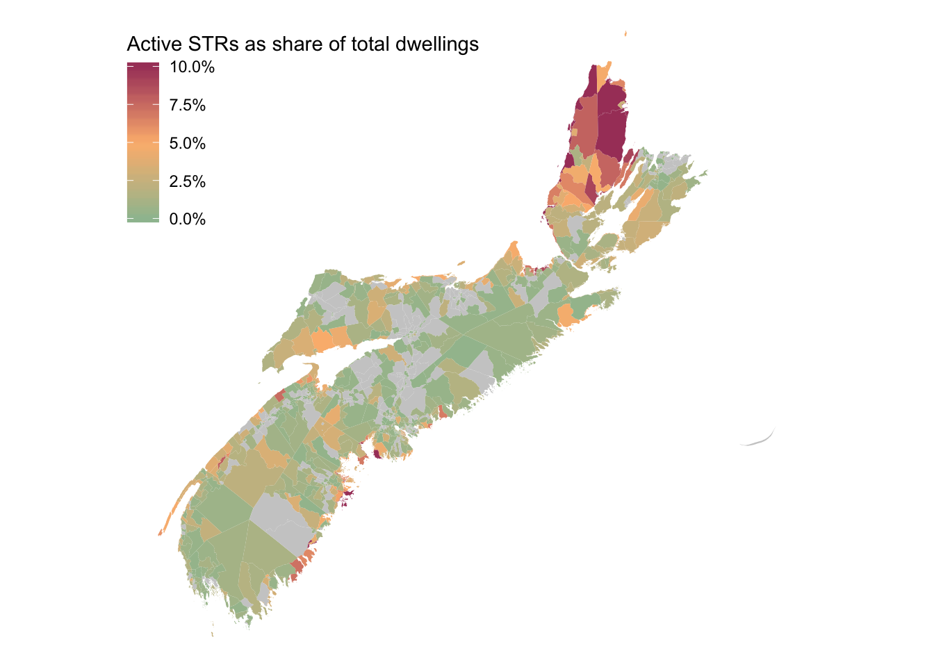
Adding the inset
We now have a very nice looking map of STR locations in Nova Scotia, but central Halifax is barely visible, despite it having the highest geographical concentration of STR activity in the province. So we’re going to add an inset map. There are several different viable ways to approach this task. My preferred solution is to use the cowplot package to stack multiple plots on top of each other, and to draw two versions of the exact same map with different bounding boxes. This lets us solve the problem of drawing the inset extent on the main map very efficiently, as you’ll see.
Our first step is going to be assigning our map to an object in the global environment so we can refer to it later. We’re also going to take this opportunity to add a coord_sf() call with expand = FALSE, which will shrink the bounding box just slightly. This isn’t really necessary yet, but will turn out to be important when we use it for the inset map, and our map already has a lot of white space, so zooming in a bit is a good idea anyway.
main_map <-
DAs %>%
ggplot() +
geom_sf(
aes(fill = listings / dwellings),
lwd = 0,
colour = "white"
) +
scale_fill_gradientn(
colors = c("#9DBF9E", "#FCB97D", "#A84268"),
na.value = "grey80",
limits = c(0, 0.1),
oob = scales::squish,
labels = scales::percent,
name = "Active STRs as share of total dwellings"
) +
# Prevent ggplot from slightly expanding the map limits beyond the bounding box of the spatial objects
coord_sf(expand = FALSE) +
theme_void() +
theme(
legend.justification = c(0, 1),
legend.position = c(0, .95)
) +
theme(
text = element_text(family = "Futura-Medium"),
legend.title = element_text(family = "Futura-Bold", size = 10),
legend.text = element_text(family = "Futura-Medium", size = 10)
) Now we’re going to add two versions of this map to a single plot using cowplot. The first version will be the whole map, and the second will be the map zoomed in to central Halifax. The trick to doing this is to manually specify the zoomed-in bounding box you want for the smaller map, and put that in a coord_sf call which will overwrite the existing coordinate limits for the inset map. If you assign a ggplot object to the global environment, you can add to it with the + syntax just as if you are building it from scratch. Functions which conflict with previously declared functions will be overwritten, which is convenient for tweaking parameters of a map after the fact. In the actual map I made for our report, I had a separate table of Halifax neighbourhoods which I used to set the bounding box, inside a coord_sf function that looked like this:
main_map +
coord_sf(
xlim = sf::st_bbox(central_halifax)[c(1,3)],
ylim = sf::st_bbox(central_halifax)[c(2,4)],
expand = FALSE
)The sf::st_bbox function returns a vector with four elements: xmin, ymin, xmax and ymax. We pass along the first and third of these as the x-axis limits, and the second and fourth as the y-axis limits.
Since we don’t have access to the central_halifax table in this example, we can just specify the coordinates directly and achieve the same result.
main_map +
coord_sf(
xlim = c(1869227, 1887557),
ylim = c(5086142, 5104660),
expand = FALSE
)## Coordinate system already present. Adding new coordinate system, which will replace the existing one.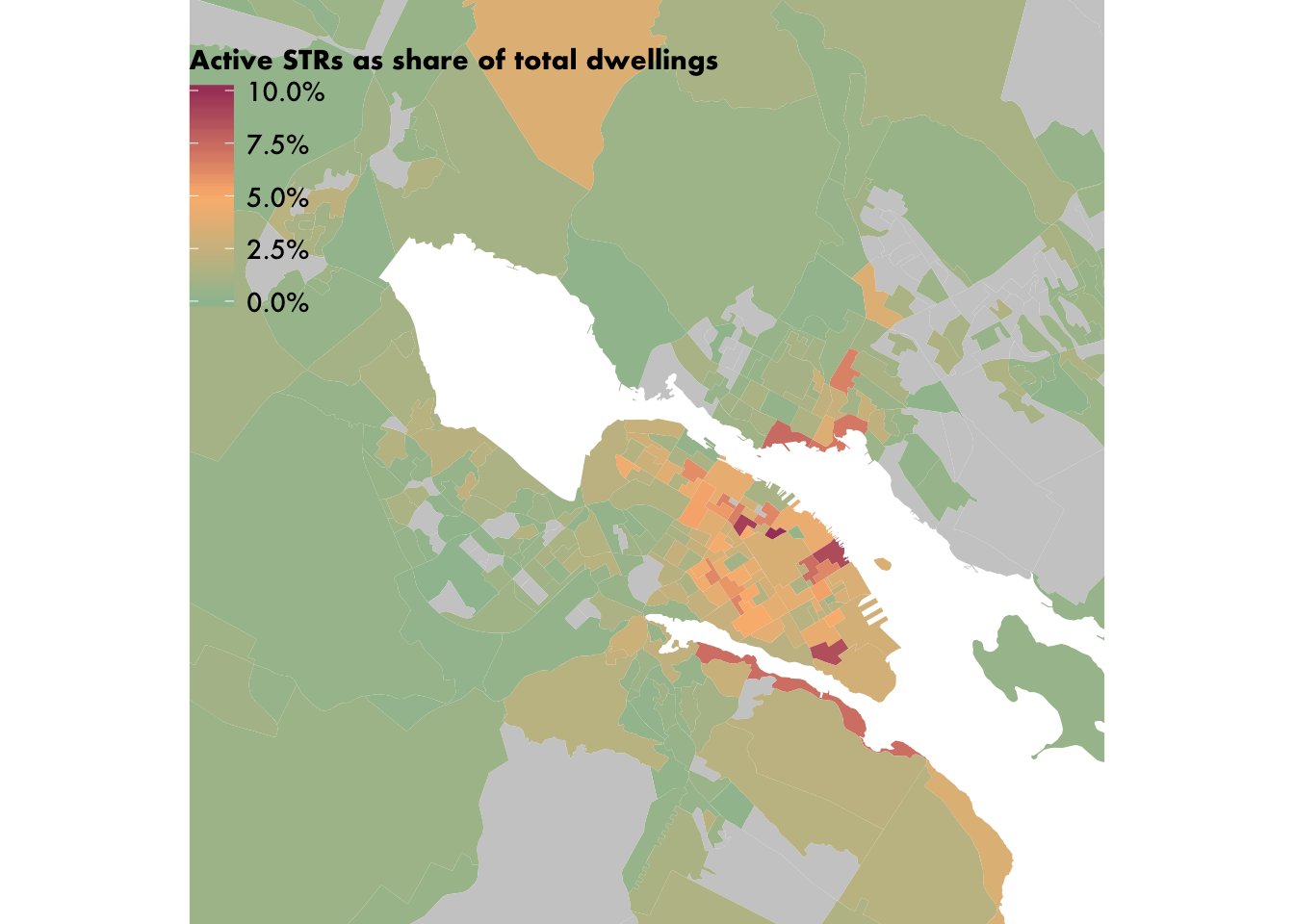
It worked! Now we draw this zoomed-in map on top of the full map. We do this by calling the ggdraw function, which lets you draw multiple plots on top of each other. The first call defines the bottom-layer map, and hence the boundaries of the entire plot. (You can also leave this argument NULL in the ggdraw call, which will initialize an empty plot.) Subsequent draw_plot calls add additional plots, with the x, y, width and height arguments controlling the positioning. I used trial and error to nail down the exact values for these arguments. In addition to drawing the plot this way, we will also make sure the legend isn’t draw a second time by adding an extra theme call.
library(cowplot)
ggdraw(main_map) +
draw_plot(
{
main_map +
coord_sf(
xlim = c(1869227, 1887557),
ylim = c(5086142, 5104660),
expand = FALSE) +
theme(legend.position = "none")
},
# The distance along a (0,1) x-axis to draw the left edge of the plot
x = 0.58,
# The distance along a (0,1) y-axis to draw the bottom edge of the plot
y = 0,
# The width and height of the plot expressed as proportion of the entire ggdraw object
width = 0.46,
height = 0.46)## Coordinate system already present. Adding new coordinate system, which will replace the existing one.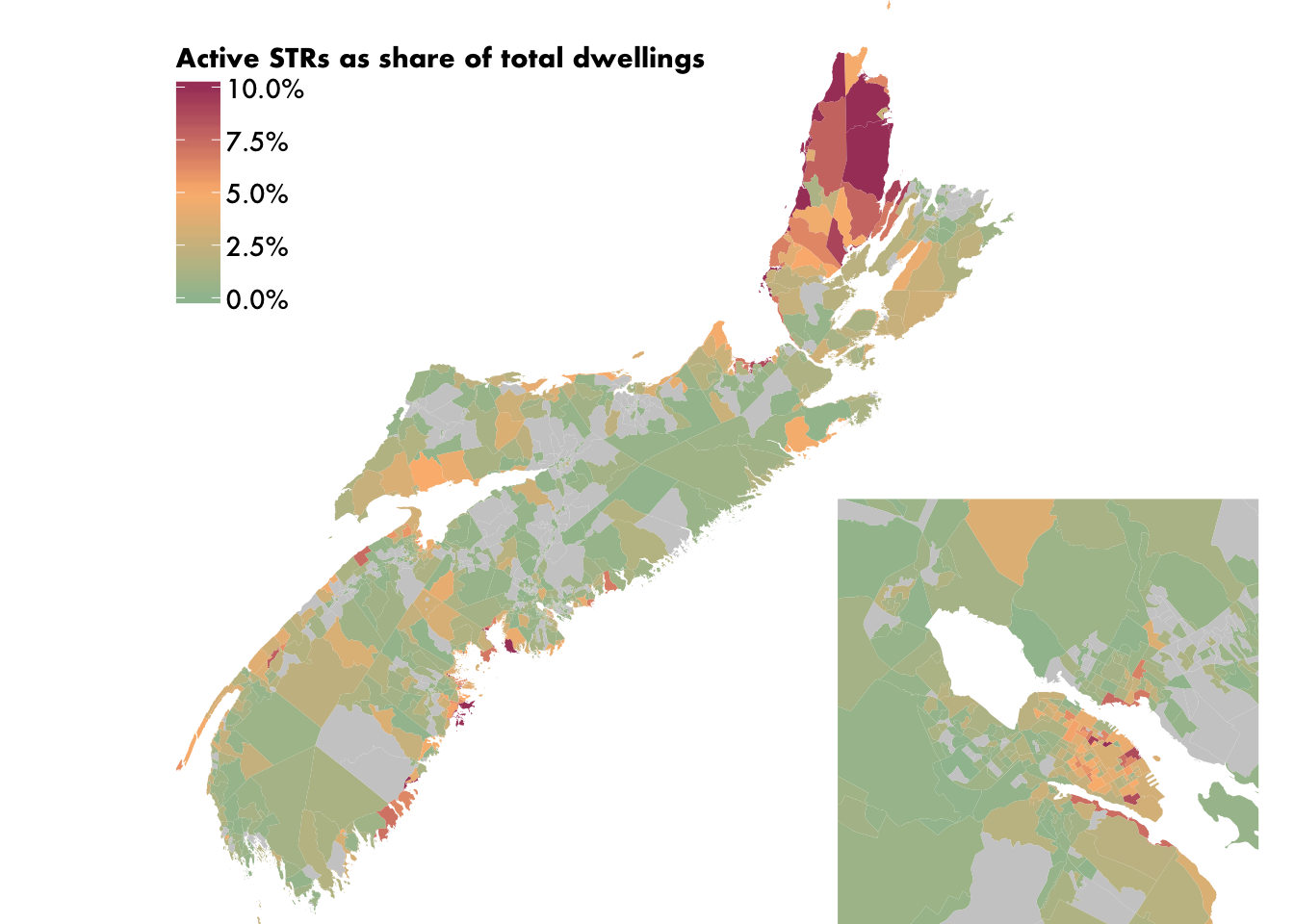
Almost done! The only thing left is to draw the inset map’s extent on the main map. As a bonus, the way we’re doing this will also give our inset map a thin outline, which we would want to do anyway. Our strategy is to simply draw a black square on the main map, set to the coordinates of the inset map’s bounding box. (We’re doing this by manually specifying the values, but if you are using another object’s bounding box for reference, you would do, e.g., xmin = st_bbox(central_halifax)[[1]], etc.) We’ll need to re-assign our main_map object when we do this.
main_map <-
main_map +
geom_rect(
xmin = 1869227,
ymin = 5086142,
xmax = 1887557,
ymax = 5104660,
fill = NA,
colour = "black",
size = 0.6
)
main_map %>%
ggdraw() +
draw_plot(
{
main_map +
coord_sf(
xlim = c(1869227, 1887557),
ylim = c(5086142, 5104660),
expand = FALSE) +
theme(legend.position = "none")
},
x = 0.58,
y = 0,
width = 0.46,
height = 0.46)
)## Coordinate system already present. Adding new coordinate system, which will replace the existing one.
And our map is done! By drawing the rectangle on the main map, our inset map ends up drawing a slight portion of the rectangle, which serves as its border.
Going further
As I discussed above, the maps we make for our public reports are meant to be visually striking and relatively sparse, so we omit some standard map elements such as compass roses and scales, and are fairly sparing with our labeling. But it would be simple to add these elements to our map if you wanted to, using the ggspatial package, which collects a number of useful functions related to map making in ggplot2.
In the coming weeks, I will be posting some more R/ggplot2/sf map making and GIS walkthroughs, including examples of faceting, using OpenStreetMap data, Voronoi polygons, and some light network analysis. Finally, for the sake of completeness, here is the complete code necessary to produce today’s map from scratch:
## Attach libraries
library(dplyr)
library(ggplot2)
library(sf)
library(cancensus)
library(scales)
library(cowplot)
## Import dissemination areas
DAs <-
cancensus::get_census(
dataset = "CA16",
regions = list(PR = "12"),
level = "DA",
geo_format = "sf"
) %>%
sf::st_transform(32617)
## Load listing data, join to DAs, and simplify geometry
load(url("https://upgo.lab.mcgill.ca/data/listings_NS.Rdata"))
DAs <-
DAs %>%
dplyr::left_join(listings_NS) %>%
dplyr::select(GeoUID, dwellings = Dwellings, listings = n, geometry) %>%
sf::st_simplify(preserveTopology = TRUE, dTolerance = 5)
## Make main map object
main_map <-
DAs %>%
ggplot() +
geom_sf(
aes(fill = listings / dwellings),
lwd = 0,
colour = "white"
) +
geom_rect(
xmin = 1869227,
ymin = 5086142,
xmax = 1887557,
ymax = 5104660,
fill = NA,
colour = "black",
size = 0.6
) +
scale_fill_gradientn(
colors = c("#9DBF9E", "#FCB97D", "#A84268"),
na.value = "grey80",
limits = c(0, 0.1),
oob = scales::squish,
labels = scales::percent,
name = "Active STRs as share of total dwellings"
) +
coord_sf(expand = FALSE) +
theme_void() +
theme(
legend.justification = c(0, 1),
legend.position = c(0, .95)
) +
theme(
text = element_text(family = "Futura-Medium"),
legend.title = element_text(family = "Futura-Bold", size = 10),
legend.text = element_text(family = "Futura-Medium", size = 10)
)
## Assemble final map with inset
main_map %>%
ggdraw() +
draw_plot(
{
main_map +
coord_sf(
xlim = c(1869227, 1887557),
ylim = c(5086142, 5104660),
expand = FALSE) +
theme(legend.position = "none")
},
x = 0.58,
y = 0,
width = 0.46,
height = 0.46)
)David Wachsmuth
Canada Research Chair in Urban Governance
My research interests include urban governance, local sustainability, and the impact of short-term rentals on housing markets.